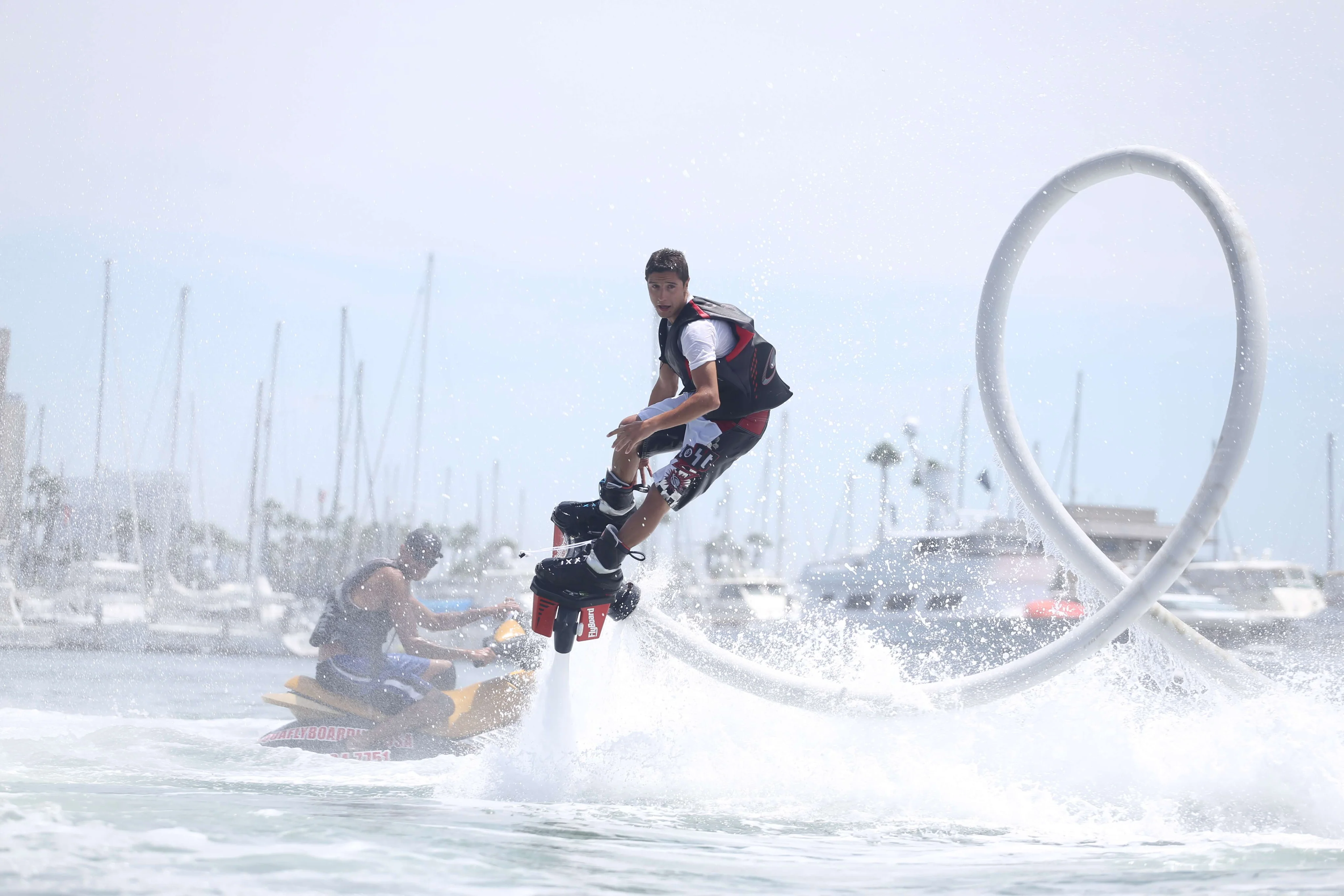
In 2024, a well-designed Jet Ski rental website is crucial to attracting customers, boosting bookings, and ensuring a seamless user experience. By avoiding common design mistakes, you can significantly enhance user satisfaction and encourage more bookings. Here’s a breakdown of the most frequent errors and how to fix them.
1. Slow Loading Speed
Website speed plays a significant role in user experience and retention. A slow-loading website can frustrate visitors and lead to high bounce rates, which negatively impact your bookings. Click here Research shows that users expect websites to load in less than three seconds.
Tip: To improve loading times, optimize images, minimize code, and choose a reliable hosting provider. Use tools like Google PageSpeed Insights to monitor and enhance your website’s performance.
2. Non-Responsive Design
With a growing number of users accessing websites from mobile devices, having a non-responsive design can alienate a large portion of potential customers. In 2024, a mobile-friendly design is essential, especially for users looking to book rentals while on the go.
Tip: Ensure your website adjusts seamlessly across different screen sizes. Test your site on smartphones, tablets, and desktops to ensure a consistent and user-friendly experience.
3. Cluttered Interface
A cluttered, overwhelming website can lead to frustration and drive potential customers away. If visitors can’t find what they need quickly, they’re likely to abandon your site in favor of a competitor.
Tip: Keep your design simple and intuitive. Use easy-to-read fonts, organized navigation, and a minimalist layout. Focus on key information like rental rates, booking options, and customer service details. The cleaner and more organized the site, the better the user experience.
4. Ineffective Booking System
A complicated or ineffective booking system can cause potential customers to abandon their reservation. The booking process should be straightforward, intuitive, and seamless, providing users with real-time availability and secure payment processing.
Tip: Integrate a real-time booking system that’s easy to navigate. Ensure it allows for instant availability updates, secure payments, and a smooth checkout experience, so customers can confidently complete their bookings without hassle.
5. Poor Visual Design and Branding
Visual appeal is one of the first things that customers notice when they visit your site. Click here A lack of cohesive branding or low-quality images can undermine your professionalism and discourage potential customers from booking.
Tip: Use high-quality images that showcase your Jet Skis, rental locations, and satisfied customers. Ensure your website’s branding—logos, color schemes, and typography—is consistent and reflects your business's identity, helping to build trust with your audience.
6. Ignoring User Reviews and Testimonials
Customer reviews and testimonials build credibility and trust. Potential customers are more likely to make a booking if they see positive feedback from past clients, especially with images of happy customers enjoying their rentals.
Tip: Display user reviews prominently on your website, particularly on key pages like the homepage and booking sections. Include images or videos of customers using your Jet Skis to make the testimonials more relatable and authentic.
7. Not Optimizing for Search Engines (SEO)
Without proper search engine optimization (SEO), your website will struggle to gain visibility on search engines, making it harder for potential customers to find your Jet Ski rental service. Effective SEO is vital to attracting organic traffic.
Tip: Optimize your website for local SEO by using relevant keywords like “Jet Ski rental near me” or “Jet Ski rentals [Your City]”. Ensure your site includes optimized metadata, alt tags for images, and high-quality, informative content to improve search engine rankings.
8. Lack of Clear Calls-to-Action (CTAs)
If your website doesn’t provide clear guidance on the next steps, visitors might leave without taking action. Whether it’s booking a rental, contacting you for more information, or signing up for special offers, clear calls-to-action (CTAs) are essential.
Tip: Use eye-catching buttons like “Book Now” or “Get a Quote” throughout the site, especially on high-traffic pages. Ensure CTAs are strategically placed, such as in the header, at the end of service descriptions, and within booking pages, to guide users smoothly toward the desired action.
9. Forgetting to Provide Essential Information
Customers need to feel informed before making a booking. Missing essential details—like rental terms, safety instructions, or contact information—can confuse potential customers and undermine their trust in your business.
Tip: Include all relevant information, such as rental policies, safety guidelines, and emergency contact details. Click here Consider adding a FAQ section to address common questions and concerns, helping customers feel confident in making a booking.
10. Not Testing Website Functionality
A website with broken links, faulty forms, or unresponsive elements can create a negative impression and frustrate potential customers. Regular testing is necessary to ensure that everything works as expected, across different devices and browsers.
Tip: Regularly test your website for functionality, checking for broken links, slow-loading pages, or malfunctioning forms. Conduct usability testing with real customers to identify any pain points and fix issues before they affect your bookings.


